Qoala
On Development
Senior Product Designer
Background
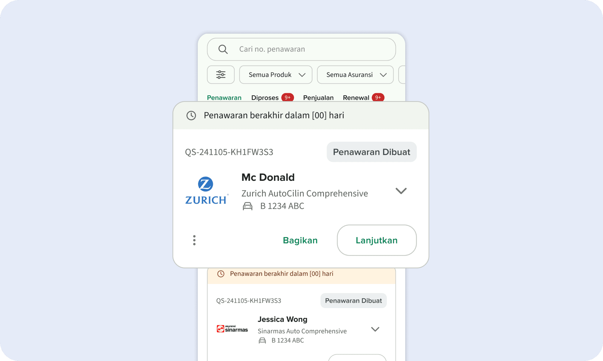
The Policy List page is a crucial part of Qoala Plus, storing all quotations and policies from the initial insurance lead to policy issuance. Each quotation or policy card contains extensive information, including the insurance product, policyholder, and insured object. However, when i do the interview with agents, they often feel overwhelmed by the dense information and unclear status display in the current card design. Especially agent that sold non-binder insurance (Custom Order) often struggle to track their quotation status. Since some status updates made by the admin team via the dashboard are not reflected in the app, agents frequently ask about their quotation progress. This gap in visibility highlights the need for better status tracking and transparency within the app. This problems inspired me to enhance the user experience, particularly by improving the clarity and usability of the quotation cards
Old Design
The existing design presents an overwhelming amount of information, making the page feel cluttered. The status display within a single card includes multiple statuses and excessive colors, causing confusion for users when scanning for the most important status. Additionally, other issues include inconsistent spacing between components, excessive font variations, and search & filter functions that only apply within selected tabs rather than globally

Project Scope
This project covers both Binder and Non-Binder insurance products, requiring a thorough review and improvement of the entire policy creation status journey. The biggest challenge? There was no proper documentation for it 😖. So, I had to retrace every step of the process, document it, and refine the experience for all insurance product types. On top of that, my Product Lead challenged me to design a Desktop Version, as user data showed a nearly 50:50 split between Mobile and Desktop usage.
First Thing to Do
First, I reviewed the entire process for both Binder and Non-Binder insurance products through the agent app (Qoala Plus) and the Internal Dashboard from the very beginning. After documenting and improving the policy status, I collaborated with the development team especially those responsible for maintaining state and substate logic—to map all statuses accurately. Here’s an example of the policy status lifecycle for a Binder Insurance Product:

Crafting the Design
After mapping all policy statuses, I structured the information architecture for each policy status card. Then, I conducted benchmarking to analyze trends in status card designs across Indonesian apps. Based on these insights, I created a low-fidelity design, refined it into a high-fidelity version, and conducted usability testing with agents and internal employees to validate the design. After several iterations, the final policy card design was reborn!

Mobile & Desktop View
The next challenge was revamping the entire Policy List Page. Since this was Qoala Plus first time providing a desktop view for the policy list, I faced some initial struggles in designing it. To tackle this, I conducted extensive research and benchmarking on desktop layouts for displaying status cards. Inspired by Google's list-detail layout, I applied this approach to the desktop version and conducted usability testing with agents and internal employees to gather feedback. After refining the design, the challenge was successfully completed delivering both mobile and desktop versions of the revamped Policy List Page!

Finisihing Remaining Feature
The final design deliverables included additional features like Search & Filters, Card Interactions, and Tab Interactions. Following the same process, I conducted benchmarking, designed the features, performed usability testing with agents, and iterated based on feedback to ensure the best user experience.

Handover The Project
Given the scale of this project, my biggest challenge was breaking down and communicating all these changes to the dev team effectively. To tackle this, the PM and I structured the grooming sessions into three phases. In the first phase, we introduced the improved Policy Status journey along with the redesigned policy card. The second phase covered the Mobile and Desktop views, explaining the general flow within the Policy List page. The final phase focused on the Search & Filter flow. Since this project heavily relies on the Policy Details Page (as the desktop view displays the details side by side with the list), the release is scheduled to align with the completion of the Policy Details Page revamp, ensuring a seamless user experience. Hopefully, this project goes live as planned, allowing me to gather user feedback and assess its impact. This will help in identifying areas for improvement and making necessary iterations to enhance the overall experience.